Explore the neuroscience and psychology of color in fine art. Discover how artists use chromatic frequencies to trigger visceral responses that transcend conscious interpretation.
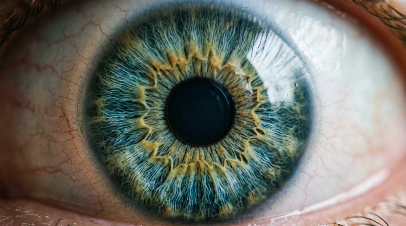
Color begins not on the canvas but in physics. Visible light exists as electromagnetic radiation traveling at specific frequencies. Red light oscillates at approximately 430 terahertz. Violet light vibrates at roughly 750 terahertz. These are not metaphors. They are measurable, objective phenomena. Yet the moment those frequencies enter the human eye, they become something far stranger: sensation, emotion, memory, meaning. The transformation happens faster than thought, and that gap between stimulus and awareness is where the most interesting things in color perception occur.
What follows is an attempt to think seriously about that gap, and about what it means for anyone who works with color deliberately.
Light as Biological Stimulus
The retina contains three types of cone cells, each sensitive to different wavelengths. Short wavelengths activate the S-cones, which perceive blue and violet. Medium wavelengths stimulate the M-cones, sensitive to green and yellow. Long wavelengths trigger the L-cones, which perceive red and orange. But this is merely the beginning of the journey. These signals travel along the optic nerve to the lateral geniculate nucleus of the thalamus, then to the primary visual cortex, and from there branch into multiple processing streams that feed information simultaneously to regions governing emotion, memory, and autonomic function.
This distributed architecture means that color perception is not localized. It is systemic. A single saturated hue can activate the amygdala, which processes fear and emotional intensity, while simultaneously engaging the hippocampus, which encodes memory. This is why certain colors feel dangerous, others feel safe, and still others evoke memories of places you have not visited in decades. The nervous system is responding to frequency, not to narrative.
Why Color Precedes Meaning
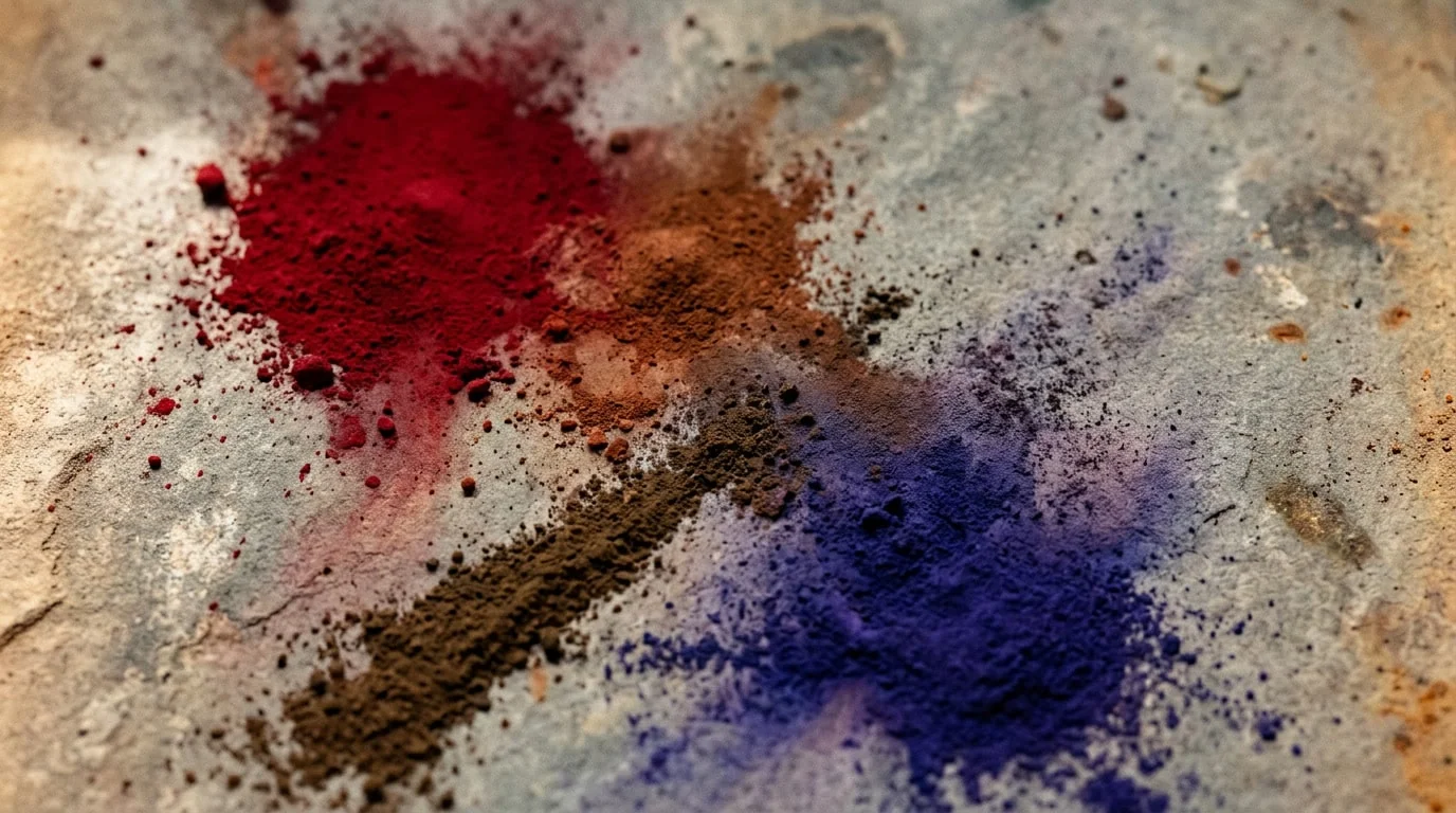
Mark Rothko spent decades exploring the psychological power of color fields, and his final series of paintings shifted toward darker, more muted palettes: blacks, grays, maroons, deep browns. These were not random choices. Rothko understood, at a level that may have preceded his own conscious articulation, that color directly modulates mood and emotional state. He was not painting representations of depression. He was using chromatic frequency to induce the physiological conditions of depression in the viewer.
Research in this area suggests that exposure to warm colors (reds, oranges, yellows) may be associated with increases in heart rate, blood pressure, and markers of arousal. Cool colors (blues, greens, purples) tend to be associated with lower heart rate and engagement of the parasympathetic nervous system. The crucial detail is timing: these responses appear to occur within milliseconds of exposure, well before conscious recognition. The body registers something about the color before the mind has formed a sentence about it.
Color does not represent emotion. It generates it. The nervous system responds to frequency before language has a chance to intervene.
This is why color can feel transgressive or dangerous in fine art in ways that subject matter often cannot. A painting of violence, rendered in cool blues and grays, may disturb the mind but leave the body relatively calm. An abstract composition in high-saturation reds and yellows can induce genuine physiological agitation while depicting nothing at all. The artist is transmitting frequency directly into the viewer's nervous system, bypassing rational filters entirely.
Saturation, Intensity, and the Threshold of Overstimulation
Not all color is created equal. The intensity, or saturation, of a hue matters profoundly. A pale pink is chemically the same color as a shocking magenta, yet they produce entirely different physiological responses. High-saturation colors demand attention. They activate the reticular activating system, the brain's arousal mechanism, which is why neon signs and highly saturated commercial imagery feel intrusive and exhausting. The nervous system interprets high saturation as a signal of importance or danger.
This is where the craft of fine art diverges sharply from commercial design. A commercial advertiser uses high saturation to force attention and trigger purchasing behavior. A fine artist uses saturation strategically, understanding that sustained exposure to maximum chromatic intensity will eventually cause sensory fatigue and psychological distress. The most sophisticated color work in contemporary fine art often involves careful modulation of saturation, the introduction of subtle variations in hue that prevent the eye from settling, keeping the nervous system in a state of productive tension rather than collapse.
Anselm Kiefer has spent decades exploring this territory. His works often combine muted, earthy palettes with sudden intrusions of high-saturation color: a slash of electric blue against charcoal and ash, a burst of crimson amid lead and straw. These chromatic interruptions are not decorative. They are psychological interventions, moments where the viewer's nervous system is jolted from contemplative calm into acute awareness.
The Temporal Dimension: How Color Changes Over Time and Distance
A crucial and often overlooked aspect of chromatic perception is that it is not static. Color shifts as the viewer moves, as light changes, as the eye fatigues. This is not a limitation. It is one of color's most profound features. The same hue viewed in morning light appears entirely different in evening light. A color that feels vibrant from across a gallery becomes subtle and complex when viewed from inches away.
This temporal and spatial dimension explains why large-scale color field paintings are so psychologically intense. The viewer cannot take in the entire color at once. The eye must move across the surface, and as it does, the nervous system continuously updates its response. Colors appear to vibrate, to shift, to breathe. This is not an illusion in any dismissive sense: the retina is experiencing genuine chromatic fatigue, the gradual desensitization of cone cells to prolonged exposure to a single wavelength. The brain compensates by enhancing contrast, making adjacent colors appear more saturated than they actually are.
The artist working with large-scale color understands this. The composition is not designed to be apprehended in a single glance. It unfolds over time, shifts as the viewer moves, changes as light conditions alter. This is why photographs of such work often fail to capture their power. The camera freezes a single moment, a single light condition, a single vantage point. The lived experience of the work is fundamentally temporal and embodied.
Chromatic Memory: The Synesthetic Bridge Between Color and Past
Perhaps the most mysterious aspect of all this is color's relationship to memory. Certain colors trigger vivid recollections of moments, places, and emotional states that the conscious mind has long since filed away. A specific shade of blue might instantly transport you to a room from childhood, complete with the smell of the air and the emotional tenor of that moment. This is not metaphorical. It reflects the cross-activation of multiple sensory and memory systems by a single stimulus.
The neurobiological mechanism, as researchers have proposed it, involves the hippocampus and the amygdala working in concert. The amygdala processes the emotional content of the color; the hippocampus retrieves associated memories. But the timing is crucial. The amygdala responds first, generating an emotional response before conscious memory has engaged. You feel something before you remember what it is. This is why color-triggered memories often carry such emotional intensity: the body has already responded before the mind has caught up.
This is also why color in fine art can feel so intimate and so universal simultaneously. A particular red might evoke a deeply personal memory for one viewer while triggering an entirely different association for another. Yet both viewers may experience a similar physiological response: a quickening of breath, a tightening in the chest, a sudden vividness of sensation. The content of the memory differs, but the chromatic frequency is identical. The work is not depicting a specific emotion. It is transmitting a frequency that each nervous system interprets through its own history.

Texture, Frequency, and the Surface as Instrument
In contemporary practice, the most sophisticated engagement with chromatic psychology often involves the integration of texture, surface quality, and the physical properties of pigment itself. When color is not applied uniformly but is instead layered, abraded, burnished, and textured, the nervous system receives multiple simultaneous signals. The eye processes both the chromatic frequency and the tactile information suggested by the surface, even though the viewer is not actually touching the work.
This is where working on metal substrates becomes particularly potent. Metal reflects light differently than canvas. It has inherent luminosity. When pigment is applied to metal and then textured, light bounces through the pigment layer, reflects off the metal substrate, and bounces back through the pigment again. The color appears to have depth, to glow from within, to possess a quality that transcends the two-dimensionality of the surface. The nervous system responds not just to the hue but to the illusion of light emanating from within the work itself.
My own Guscio technique grew out of years of experimentation with exactly this territory: layering, texture, and metal substrates combined to create a surface where color and light become inseparable. The work shifts as the viewer moves and as light conditions alter. It is not a static color experience. The nervous system is continuously processing new information, continuously updating its response. Whether working with abstract color fields, textural landscapes, or figural subjects, the integration of chromatic intensity, surface texture, and light reflection means the work operates simultaneously on multiple levels of perception. The conscious mind apprehends the composition. The nervous system responds to the frequency, the texture, the light. Both are happening at once, in dialogue with each other.
The Ethics of Chromatic Power
There is an ethical dimension to working with color at this level of sophistication. The artist who understands that color bypasses rational thought and speaks directly to the nervous system possesses a kind of power. That power can be used to manipulate, to overwhelm, to induce states of distress. Commercial culture exploits this knowledge constantly, using chromatic intensity to trigger purchasing behavior, to override rational decision-making, to create states of artificial desire.
Fine art, at its best, uses this same knowledge differently. Rather than seeking to override the viewer's agency, sophisticated color work invites the viewer into a dialogue with their own nervous system. The work does not tell you what to feel. It creates the conditions for you to feel, and leaves you free to interpret and respond to that feeling. This is the difference between manipulation and invitation, between propaganda and art.
The viewer standing before a work that engages the chromatic unconscious is being offered an opportunity to know themselves differently, to experience their own nervous system's responses, to recognize the degree to which they are always already responding to frequencies and stimuli below the threshold of conscious awareness. This is not comfortable knowledge. But it is liberating knowledge. It suggests that perception itself is not a passive reception of information but an active, embodied, neurological event in which we are all participants.
Color in fine art is neither decoration nor representation. It is a direct transmission of frequency into the viewer's nervous system, a conversation between the artist's intention and the viewer's physiology. In that conversation, language falls away. Meaning becomes sensation. And the boundary between the self and the work dissolves into something far more mysterious and far more real.