Explore the neuroscience and psychology of color in interior design and fashion.
In 1975, a neuroscientist named Paul Ekman conducted a simple experiment. He asked participants to hold a pencil between their teeth for thirty seconds without letting their lips touch it. The result: their brains registered the facial position as a smile, and their mood measurably improved. The body shapes the mind. And so does color.
Color is not a luxury. It is not decoration, not an afterthought, not something to be applied once the "real" decisions about a room or outfit are made. Color is a neurological command. The moment photons of a particular wavelength enter your eye and strike the retina, a cascade of chemical and electrical signals travels through your visual cortex, your limbic system, your autonomic nervous system. Your pupils dilate or constrict. Your heart rate shifts. Your cortisol and serotonin levels fluctuate. Your sense of time warps. You become, quite literally, a different person than you were before you entered that room or put on that garment.
This is not mysticism. This is biology. And yet most of us choose the colors that surround us and adorn our bodies with the same casual indifference we might apply to selecting a cereal brand.
The Neuroscience of Chromatic Experience
The human eye can distinguish approximately 10 million different colors, yet we rarely think about color as information. We think of it as feeling. But feeling, in the precise neurological sense, is information processing. When you look at red, your brain is not having an opinion; it is receiving data.
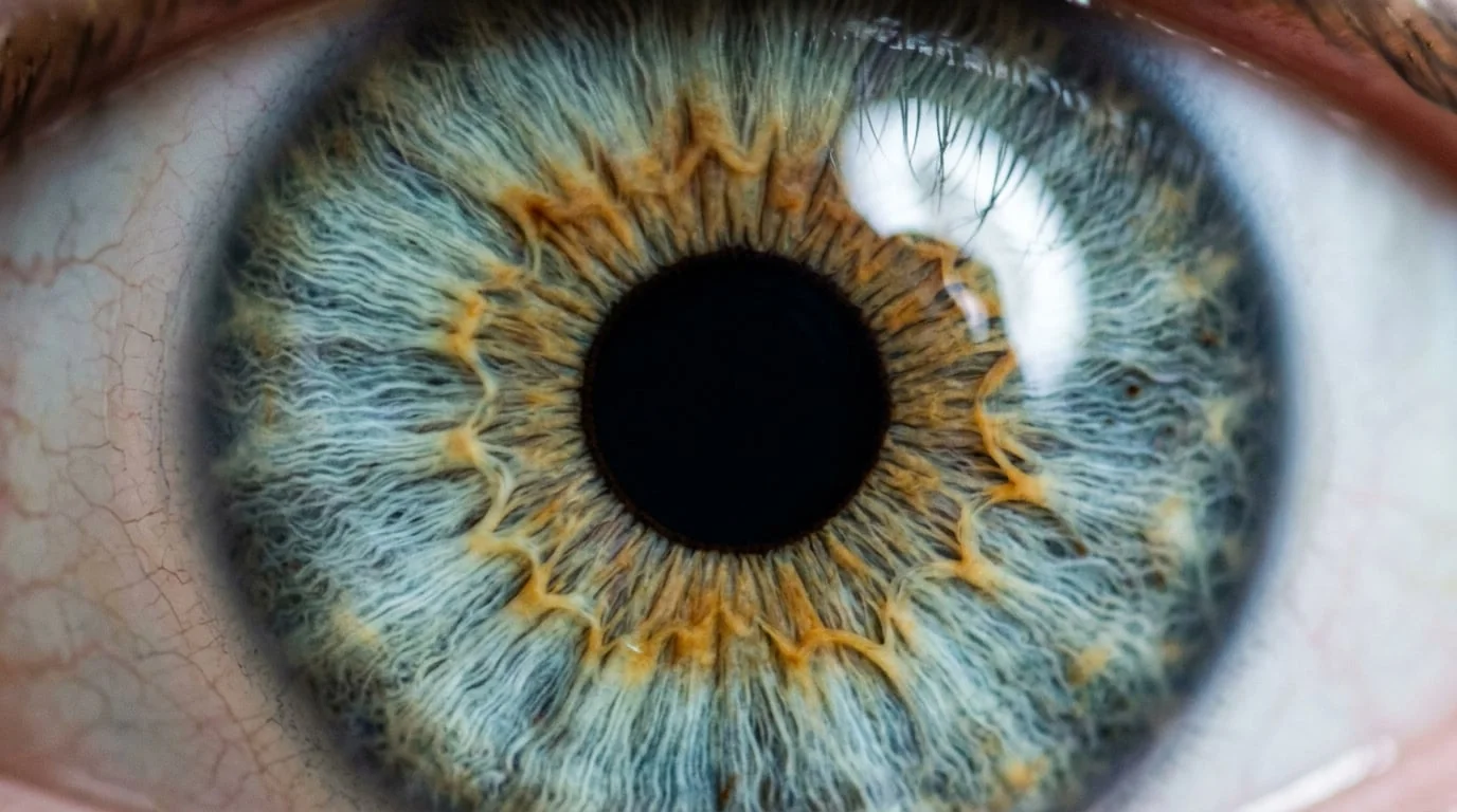
Red light has a wavelength of approximately 700 nanometers. When this light enters your eye, it activates long-wavelength cone cells in your retina. These cells send signals to your brain's color-processing center in the V4 region of the visual cortex. From there, the signal branches: some neurons carry the information about the physical wavelength; others carry information about the emotional and cultural associations you have learned to attach to that color. In a fraction of a millisecond, your brain synthesizes both streams of data and produces an experience: excitement, danger, passion, appetite, aggression, or warmth, depending on context.
The artist and theorist Josef Albers spent decades exploring this phenomenon. His 1963 book "Interaction of Color" documented how the same color appears entirely different depending on what surrounds it. Place a square of orange against a red background, and it appears yellow-orange, cool, almost acidic. Place the identical square against a yellow background, and it appears deep, warm, almost red. The color has not changed. Your brain has changed. This is not a trick of perception; it is a fundamental truth about how consciousness works. We do not see colors; we construct them.
The same pigment can evoke entirely different emotional responses depending on its context, the light that surrounds it, and the viewer's personal and cultural history. There is no objective color experience.
This principle has profound implications for how you design your environment and compose your appearance. A bedroom painted in soft blue will lower your cortisol levels and promote deeper sleep, but only if the blue is the right blue. Too bright, and it becomes stimulating rather than calming. Too desaturated, and it registers as melancholy rather than peaceful. The difference between a restorative space and a depressing one is often just a few nanometers of wavelength.
Color, Identity, and the Self We Perform
Fashion historian and theorist Jennifer Craik has argued that clothing is not a surface decoration but a fundamental technology of identity construction. What we wear is not an expression of who we are; it is a performance that, through repetition and social reinforcement, becomes who we are. And the colors we wear are the most immediate, most visceral element of that performance.
When Coco Chanel introduced the "little black dress" in 1926, she did not simply create a garment. She created a color strategy. Black, which had been associated with mourning and servitude, became associated with sophistication, simplicity, and power. Women who wore black were not mourning; they were making a statement about their relationship to modernity, to labor, to their own bodies. The color black literally changed what it meant to be a woman in the twentieth century.
This is not hyperbole. There is measurable neuroscientific evidence that the colors we wear affect how others perceive us and, more importantly, how we perceive ourselves. A 2012 study published in the journal "Psychological Science" found that when participants wore red, they performed better on tasks requiring focus and attention to detail, and others rated them as more competent and dominant. When they wore blue, they performed better on creative tasks and were perceived as more trustworthy. The color did not change their actual abilities; it changed their confidence, their posture, their eye contact, their tone of voice. The color became them.
This phenomenon is called "enclothed cognition." Your clothes are not just on your body; they are in your mind. They alter the way you think, the way you move, the way you present yourself to the world. And color is the most powerful variable in this equation. You can wear the most perfectly tailored jacket in the world, but if it is a color that does not resonate with your nervous system, that does not align with the identity you are trying to construct or perform, it will feel like a costume rather than a second skin.
The Chromatic Architecture of Domestic Life
Interior designers understand something that most people do not: your home is not a backdrop for your life. It is a participant in your life. It shapes your mood, your energy levels, your social behavior, your sleep patterns, your appetite, your creativity, your sense of peace or restlessness.
The color of your bedroom walls affects your circadian rhythm. Cool colors (blues, greens, purples) signal to your brain that it is evening, that melatonin should be produced, that sleep is appropriate. Warm colors (reds, oranges, yellows) signal alertness and wakefulness. Paint a bedroom in a warm orange, and you will struggle to sleep, no matter how comfortable your bed is. The color is overriding your conscious intention.
Similarly, the color of your kitchen affects your eating behavior. Warm, saturated colors increase appetite and speed up eating. This is why fast-food restaurants are painted in reds, oranges, and yellows. Cool colors decrease appetite and slow down eating. A kitchen painted in soft green or blue will naturally encourage you to eat more mindfully, to linger, to savor. The color is doing the work of discipline and intention for you.
The psychologist Roger Ulrich conducted groundbreaking research in the 1980s on the effects of color and natural imagery on hospital patients. He found that patients with a view of nature recovered faster from surgery, experienced less pain, and required fewer pain medications than patients with a view of a brick wall. But even more striking was his finding about color in the absence of nature: patients in rooms with warm, saturated colors and natural light recovered faster than patients in rooms with cool, desaturated colors, even when both groups had no window view. The color itself was doing healing work.
The Contemporary Art World and Chromatic Consciousness
Contemporary artists have become increasingly sophisticated in their understanding of color as a tool for shaping consciousness. The artist James Turrell has spent five decades creating installations that isolate color from form, allowing viewers to experience pure chromatic sensation. In his "Roden Crater" project, a massive earthwork in the Arizona desert, he has carved apertures that frame the sky at specific times of day, allowing visitors to witness how the atmosphere itself becomes a color-generating medium. The experience is not visual; it is neurological. Visitors report profound emotional and even spiritual effects from standing in these spaces, even though they contain no objects, no narrative, no representational content. Just color. Just light. Just the raw data of perception.
Similarly, the artist Olafur Eliasson has created immersive environments where color and light are the primary subject. His "Weather project" at the Tate Modern in 2003 consisted of a massive artificial sun suspended in the museum's cavernous atrium, surrounded by mirrors and monochromatic light. Thousands of visitors lay on the floor for hours, bathed in this warm, golden light, experiencing what many described as a profound sense of peace and connection. The artist had not told a story. He had not represented anything. He had simply engineered a chromatic experience that bypassed language and narrative and spoke directly to the nervous system.
This shift in contemporary art reflects a broader cultural recognition: color is not decoration. Color is knowledge. Color is a language as complex and meaningful as words, and perhaps more direct in its access to emotion and consciousness.
The Guscio Technique and Textural Chromatic Depth
Contemporary fine art, particularly in large-scale works that demand to be experienced spatially and somatically, the relationship between color and texture becomes paramount. When an artist works with the signature "Guscio" technique, a method that builds chromatic depth through layered, textural application, the viewer's experience shifts from passive observation to active engagement. The color is no longer flat; it breathes. It has dimensionality. It catches light differently depending on the angle of viewing, the time of day, the viewer's position in space.

This approach transforms color from a two-dimensional property into a three-dimensional material. The viewer's nervous system responds not just to the wavelength of light but to the physical presence of the pigment, the texture, the implied labor and intention embedded in the surface. The color becomes an object, a thing in the world, rather than a mere visual attribute. This is why artists who work with texture and dimensional color application create spaces that feel alive in a way that flat color cannot. The work is not something to be looked at; it is something to be inhabited.
The emotional impact of such work extends beyond the gallery or studio. When these principles are applied to domestic spaces or wearable art, the effect is similarly profound. A textured, dimensionally applied color on a wall or a garment engages the viewer's entire sensory apparatus. It creates depth, complexity, and a sense of presence that flat color cannot achieve. The space or the garment becomes not a backdrop but a participant in the viewer's emotional and cognitive experience.
Explore the full range of contemporary textural and chromatic work in abstract paintings and applied arts, where color and texture converge to create immersive experiences that reshape the spaces and identities they inhabit.
Choosing Color as an Act of Self-Definition
The practical implication of all this research is simple but radical: the colors you choose for your home and your body are not aesthetic preferences. They are identity choices. They are neurological choices. They are choices that, through repetition and embodiment, literally shape who you become.
This is why the process of choosing color should never be casual. Stand in the room at different times of day. Observe how the color changes under natural light, under artificial light, at dawn and at dusk. Notice how your mood shifts as the color shifts. Sit with the color. Let your nervous system respond. Ask yourself: does this color make me feel more like myself, or less? Does it energize me or deplete me? Does it align with the identity I am trying to construct, or does it contradict it?
Similarly, when choosing colors to wear, move beyond the superficial question of "what looks good on me" and ask instead: "what does this color do to me?" How does it affect my posture, my confidence, my energy level? When I wear this color, do I feel more like myself or less? Do I move differently? Do I think differently? Do others respond to me differently?
These questions are not vain. They are practical. They are about recognizing that color is not a luxury but a necessity, not a decoration but a technology of consciousness. The colors you choose are the colors that choose you.
For deeper exploration of how color and texture interact in contemporary fine art, and how these principles can be integrated into your own spaces and aesthetic choices, visit the full collections of work that demonstrates the power of chromatic depth and dimensional color application. The work itself is a laboratory for understanding how color shapes experience, identity, and the spaces we inhabit.
The science is clear. The implications are yours to explore. The colors you surround yourself with and the colors you wear are not passive choices. They are active declarations about who you are and who you are becoming. Choose them with intention. Choose them with awareness. Choose them as the powerful tools they are.